


Apple Music tradedits red for a sound
Apple Music’s new identity was made by playing music through a bath of oil and filming what happened. It also let go of its red. We think it traded a colour it was only using for a sound it can own, and the reasoning works well beyond Apple.

 Words:
This week Apple Music released its first new identity since the service launched in 2015. It was made with TBWA\Media Arts Lab, the producer Fred again.. and the sound designers NEST Acoustics, and Apple’s line for the whole thing is made by sound. The new look starts appearing in Apple Music’s own shows and events now, and arrives on everyone’s phone with the next software update.
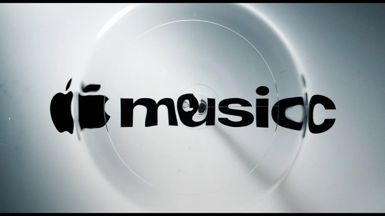
The phrase is meant literally. The team broke music down into single notes and played them through a transducer, a small device that turns an audio signal into vibration. The transducer sat under a shallow bath of mineral oil. Acrylic versions of the music note and the wordmark sat in the oil, and as the sound moved through it, the surface rippled and the light bent around the shapes. They filmed it in camera, and that footage became the raw material for the logo animation and the wider look.
Fred again.. and NEST wrote the short piece of music that drives it, which doubles as the brand’s new sound. Apple’s behind-the-scenes film walks through the whole process, and it is worth a minute and a half of anyone’s time.
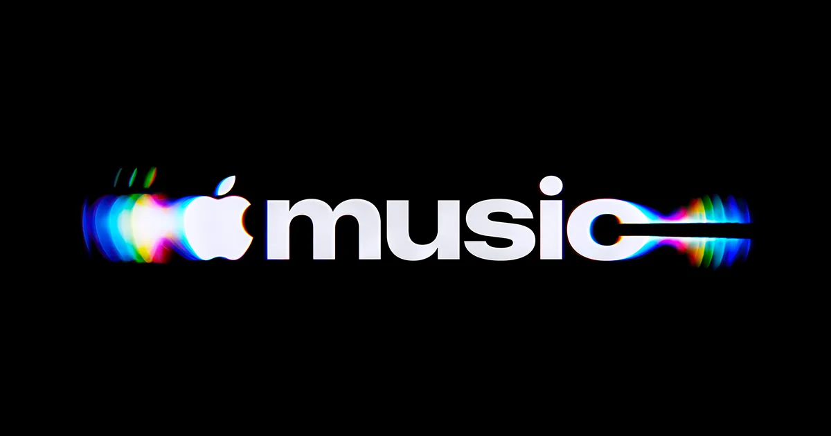
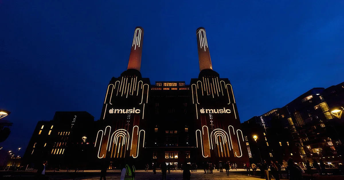
Around that sits a new wordmark: the Apple symbol next to a bold, lowercase “music” set in a custom cut of Apple’s own typeface. It was quietly road-tested last month on the signage for Apple Music Hall, the new six-hundred-seat venue at Battersea Power Station in London. It looks less like a software label and more like the masthead of a music magazine.
And the app icon, the red one, is going black and white.
The part people noticed
When the monochrome icon turned up in a beta last week, the response was mostly unhappy. People missed the red. A few said they would move to Spotify over it, which we doubt. It is a fair reaction. Colour is usually the first thing people recognise a brand by, and Apple Music has just set its colour down.
We would make the case it was the right call, and the reason is in the category. Spotify owns green. YouTube Music is red too: a red circle on a phone screen, a swipe away from Apple’s red square. In music streaming, red was never really Apple’s. It was a colour Apple was using.
Compare that with Coca-Cola, which we wrote about a couple of musings ago. Coke kept every asset it had, because every one of them was unmistakably Coke’s. Apple Music looked at its most recognisable asset, decided it was not ownable, and replaced it with something that is.
Before you let go of something people know you by, ask whether it was ever really yours.
Made from the work, not drawn to look like it
Most identities are made to represent what a company does. A designer draws a shape that stands for music, or speed, or care. This one is made from what the company does. The visuals are not a picture of sound. They are a by-product of it.
That matters more than it sounds. A picture of something can be copied by anyone with the same software. A by-product can only be copied by doing the same work. A competitor who wanted this look would need a composer, a transducer, a tray of oil and a few months, and even then it would look like their music, not Apple’s.
Rather than creating visuals to represent music, the team set out to let music create the visuals itself.
The asset most brands do not have
There is a second asset here that gets less attention, and it is the sound itself. Most brands we meet have a logo, a palette and a typeface, and no sound at all. Yet nearly everything they publish now makes a noise: the video on the homepage, the social clip, the podcast, the reel, the message you hear on hold.
Apple has now done this twice in a year. Last year Apple TV got a new identity shot in real glass and a short sonic signature written by Finneas. Now Apple Music has one, written by Fred again.. and NEST.
There is some evidence it is worth doing. An Ipsos study from 2020 found that video ads using a brand’s own sound cues were far more likely to perform well than ads without them, and that sound made up only a small sliver of the brand assets companies actually use. We would hold the exact multiple loosely, as we would any single study. The direction we believe, because people do not always watch. They hear.
I learned that making political ads in New York. You would spend days on a thirty-second spot for a city council race, every frame argued over, and then remember that a lot of people meet a TV ad from the next room. The kettle is on. The kids are loud. They hear it and never see it.
The spots that worked were the ones you could follow with your eyes shut. That never stopped being true. It just moved from the living room to a phone in someone’s pocket with the screen off.
Two cautions
The first is that a behind-the-scenes film is also marketing. Showing the process has become a genre of its own, and Apple is very good at it. When the Apple TV identity launched, its agency said craft should be “felt, not faked.” At a time when anyone can generate a slick image in seconds, made for real is a selling point, and Apple knows it.
The process only earns its keep if the result holds up without the story attached. On a phone, at the size of a fingernail, nobody is watching the documentary. They are looking at an icon.
The second is about the colour. Dropping a recognisable asset is a real cost, and Apple can afford it because the logo next to the word “music” does most of the recognising. A smaller brand that drops its colour does not have a piece of fruit to fall back on. If you are going to give something up, be sure what you put in its place is more yours than what you are losing, not just newer or tidier.
For a business that is not Apple
None of this needs a transducer.
Find the material only you have. For a builder, that might be the site drawings. For a winemaker, the soil. For an engineering firm, the survey data nobody outside the office ever sees. An identity that grows out of that material is harder to copy than one drawn to stand for it.
Give the brand a sound before you need one. You are already making things people hear. A few seconds that open every video and every podcast, used every time, costs less than a new logo and works when nobody is looking.
Check what you are giving up. Before you retire a colour, a shape or a line people know you by, ask whether it was ever really yours, or whether you were just the one using it.
The phrase Apple chose is “made by sound.” The idea worth keeping is smaller and more useful than that.
The best brand assets are not drawn to look like the work. They come out of it.