
The Coke rebrandis a rulebook, not a logo
Coca-Cola relaunched its identity across two hundred markets and barely touched the logo. The internet argued about cigarettes. The real change is that the brand guidelines now run inside the design tools, and that is a governance story, not a design one.
 Words:
 On 20 July, Coca-Cola launched a new global visual identity across more than two hundred markets, and almost nothing changed.
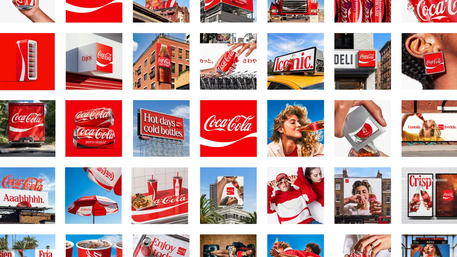
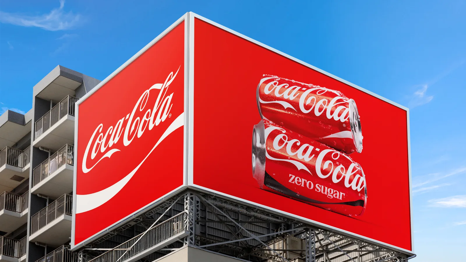
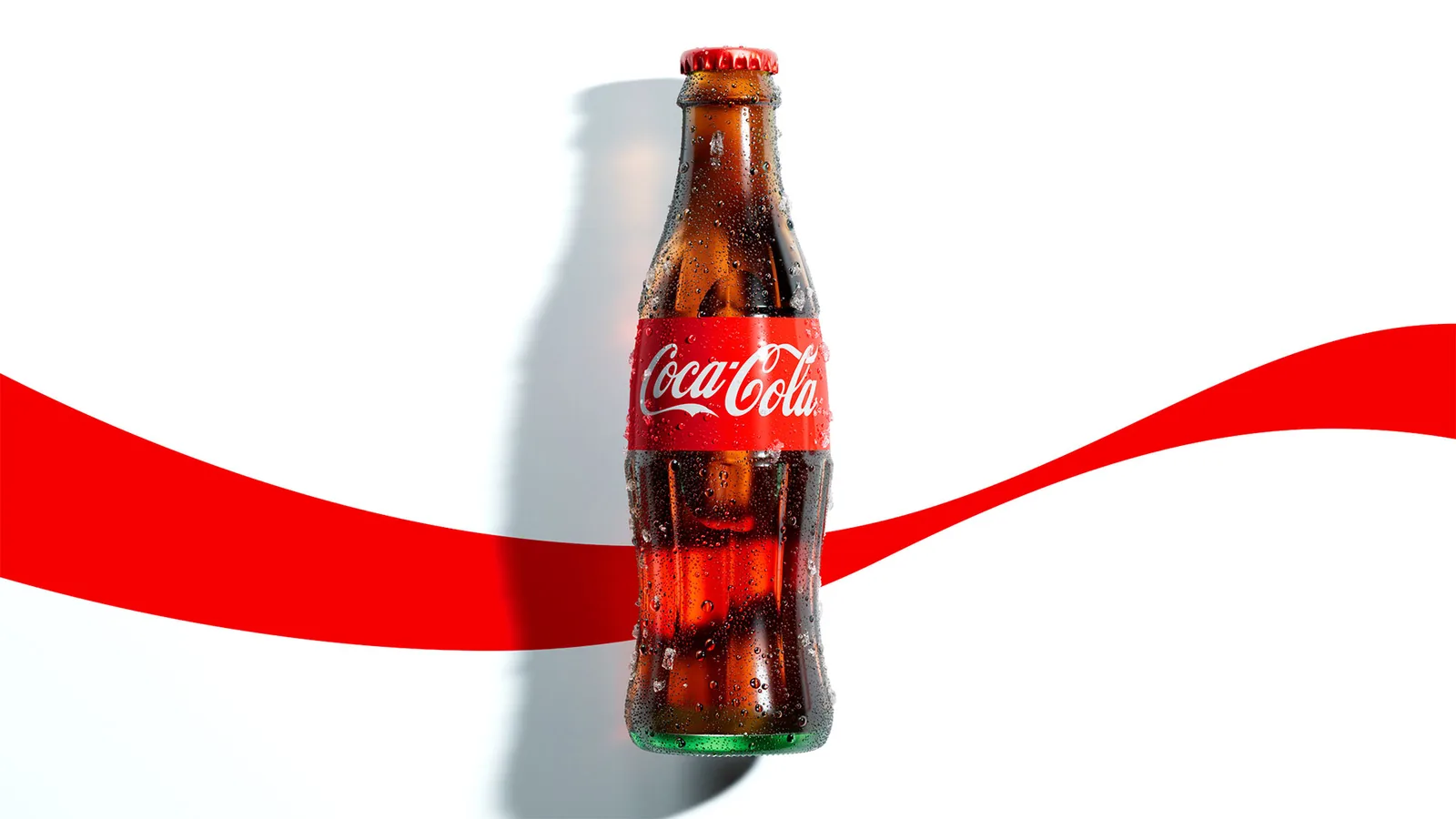
JKR led the identity. The Superultrarare did the packaging system. Brody Associates handled the type. And what they delivered, after all that, was the same brand turned up a notch. The Spencerian script is untouched. The red and white are the same, only louder. The Dynamic Ribbon, the white wave that has been on the pack since 1969, gets more room. The Arden Square, the red box with the script inside it, also from 1969, comes back as the main lockup. The wordmark runs vertically up the can again after about a decade sitting sideways. Zero Sugar gets bigger type, a black ribbon and a black cap.
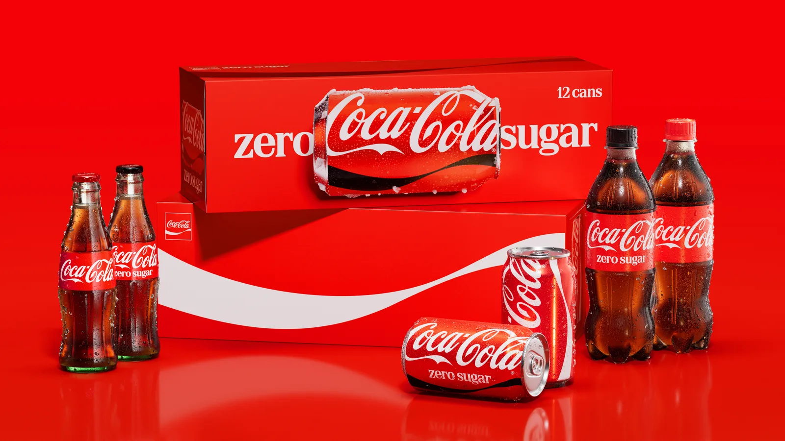
The company’s own line for the whole exercise was “making Coca-Cola more Coca-Cola.” Rapha Abreu, the company’s global vice president of design, told Brand Innovators the team went back through the archive and found the brand at its best when it was simple, confident and expressive. So that is what they made. Simpler, more confident, more of the same.
Our job was to find what makes Coca-Cola the most recognisable version of itself, then amplify it for today.
The internet, naturally, found the one thing to argue about. The serif face on the new cans, set in red and white, reminded people of a cigarette packet, and for about a week Coke was “fridge cigarettes” on TikTok. That was the design conversation the rebrand generated. It is a fair observation, and it is beside the point.
A brand this size does not have a recognition problem
Coca-Cola pours 2.2 billion servings a day. Nobody on earth needs help identifying one. What a brand that size has is a consistency problem, and the people who did the work said so.
Pretty quickly, we all realized there was something bigger to solve. There was a need for more consistency.
Two hundred markets. Hundreds of bottlers. Thousands of local agencies, every one of them making something in Coke’s name this afternoon, each interpreting the guideline slightly, each under deadline, each granting itself a small exception. That is drift. It is never dramatic. It is a thousand small deviations, none of which matter alone, that together move a brand somewhere nobody chose.
I watched this happen at a much smaller scale. When my old ad agency back in New York grew from two of us to a team of more than twenty, the first thing I lost was not quality. It was sameness. Every designer’s hand started showing in the client’s work. A blue crept brighter on one account because a version had performed well and everyone copied that file. Headings drifted into title case on another because a new hire preferred it. No single decision was wrong. The accumulation was, and by the time I noticed, the deviations had become the working standard. Fixing it meant a disruptive reset instead of a quiet nudge.
That is the problem Coke has, multiplied by every country it sells in.
The real rebrand is the rulebook
Alongside the identity, Coca-Cola shipped a new Brand Center and what its press release calls “tech-powered Design Intelligence tools” for internal teams and agency partners. Those tools have a history. In May 2025, Coca-Cola and Adobe announced Project Fizzion, then a pilot: a system that watches designers work in Illustrator, Photoshop and InDesign, encodes the brand’s rules into what they call a StyleID, and applies those rules in real time as the work is made. Coke’s own claim was that teams could ship up to ten times faster without losing brand integrity. By late July this year, Forbes was reporting the system deployed across those two hundred markets, flagging off-brand work before it ships.
With Fizzion, our design elements become smart. Creativity can move faster, without losing its soul.
We would treat the speed claims with the usual caution, because they are the company’s own. The shape of the thing we believe, because it is the obvious next step.
For a hundred years a brand guideline has been a document. A PDF. A beautifully produced book that flatters the agency, reassures the client, and gets opened once, on the first day, by the person who actually produces most of the brand’s output. The guideline only worked if someone read it. Coke has moved the rules from the document into the tool, so the guideline does not have to be read to be followed. That is the change. The most recognised brand in the world admitted that its rulebook was not governing anything, and fixed the rulebook rather than the logo.
A rule that only works if a tired person remembers it is not governance. It is hope.
We said something close to this in episode ten of Shallow DeepDive, when we argued brand guidelines need an AI chapter, and in episode eight, when we argued a brand has to be legible to machines as well as people. Coke has gone one further and made the machine the reader.
What a machine cannot hold
Now the caution, because there is one, and it is real. A machine can hold a rule. It cannot hold judgement. It can tell you the red is the wrong red. It cannot tell you the ribbon should not be there at all this time, or that a local market’s festival pack needs something the global system never anticipated. Encode the rules too tightly and you do not get a coherent brand. You get a frozen one, with every happy accident that keeps an identity alive filtered out before it happens.
To their credit, Coke seems to know this. Abreu told Creative Review the goal “wasn’t to create a rigid global system,” and the markets keep their say over photography, messaging, partnerships and local activations. The four things that are locked are the four things that carry the recognition. Script. Ribbon. Square. Red and white.
That short list is the design work of this project. People went through a hundred and forty years of archive and decided which handful of elements were non-negotiable, and that decision was made in a room, by designers, not by software. The software just stops those four things leaking. Get the list wrong and it will enforce the wrong brand very efficiently.
One of my favourite aspects of this project is a tiny one that may well go unnoticed: the app icon. This uses nothing but the ribbon, and proves once and for all what a powerful and hitherto underutilised asset this really is.
That is judgement, not compliance. Somebody looked at the ribbon and decided it could carry an app icon on its own. No rule engine produces that decision. It only protects it afterwards.
The one-page version
Most of the brands we work with are not Coca-Cola, and none of them need Adobe to build them a compliance layer. The lesson is smaller and more useful than that.
Decide what is genuinely non-negotiable, and keep the list short.
Write those few things so plainly that a tired person at nine at night, or a model handed the file, can apply them without a phone call.
Name one person whose job is to notice drift.
Put a review on the calendar before the project closes, not after the first time something goes wrong.
That is governance. It fits on a page. Most brands we meet have the two-hundred-page book and none of the page.
The last thing worth sitting with is the direction Coke ran. Most rebrands start from the assumption that the problem is the look, and end with a new logo, a launch film and the same drift twelve months later. Coke looked at itself, decided the logo was fine, and concluded the discipline was not.
It is the least glamorous conclusion a brand can reach about itself, and it is the one most of them need.