

Q+A · No. 05 · Brand
What should be in our brand guidelines?
A brand guide shouldn't be a museum. It should be a working agreement that helps people make things.
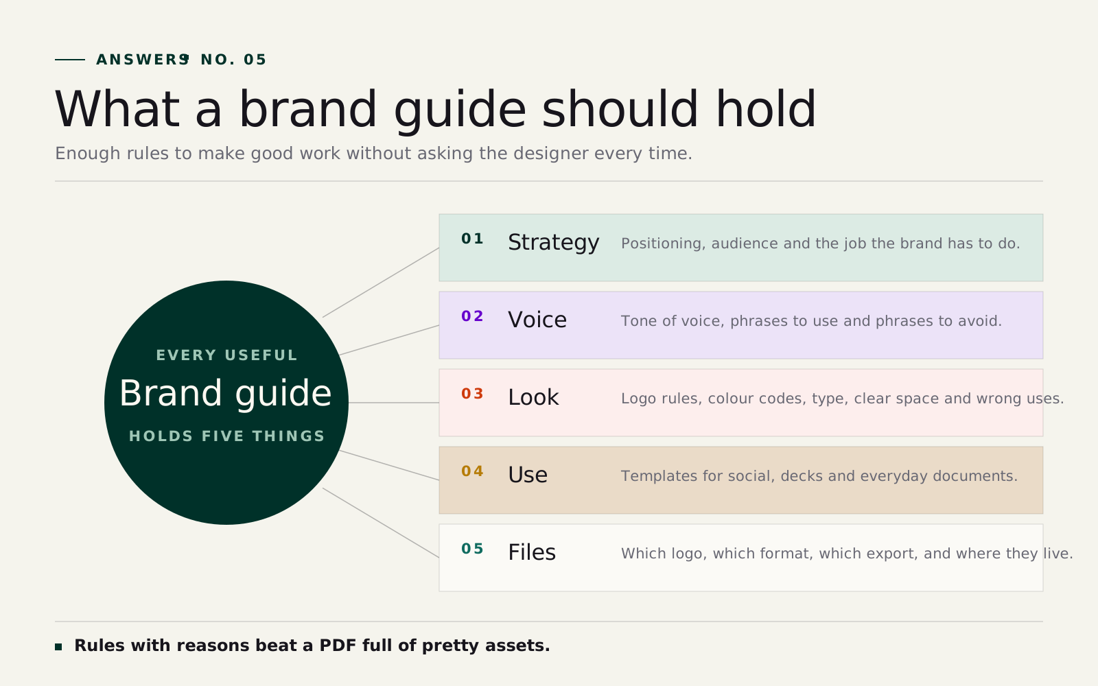
Everything someone needs to make something without the original designers in the room: the strategy behind the brand, the voice, the logo, colour and type rules, layout principles, worked examples and the files themselves.
If the guide only looks impressive as a PDF, it has missed the job. The test is whether a new supplier, a new hire or your own team can produce something on-brand from it, unassisted.
The longer answer
Start with the reason
Rules are easier to follow when people understand why they exist. A useful guide starts with the strategic foundation: what the brand is trying to be known for, who it speaks to, what it should sound like, and what kind of behaviour would weaken it. Without that, the guide becomes a police document. People follow it mechanically, or avoid it entirely.
How the guide gets made
A strong guideline process moves through six stages: define the brand, build the identity system, test it on real touchpoints, document the rules, show examples and hand over the assets. A brand that only works on a hero slide isn't finished. It needs to survive a website header, a LinkedIn post, a sales deck, signage and a dull internal form.
That sequence lines up with our own QC Process. The guide shouldn't appear at the end as admin. It grows out of the work.
What should be included
The exact contents depend on the organisation, but a practical guide usually covers:
- Brand idea, positioning and audience notes.
- Voice and tone, with phrases that feel right and phrases to avoid.
- Logo system: lockups, clear space, minimum sizes, misuse examples.
- Colour palette with HEX, RGB, CMYK and Pantone values where needed.
- Typography rules for print, web and office documents.
- Photography, illustration and icon direction.
- Layout principles for social, web, print and presentations.
- Accessibility basics, including contrast and legibility.
- Templates for the assets the team makes most.
- File guidance, so people know which logo or export to use.
That last point is the one most guides skip. A good guide goes further than "use the primary logo". It helps someone choose between the primary logo, reversed logo, mono mark, SVG, PNG and print file without asking the designer every time.
Keep the guide close to use
Guidelines fail when they're too precious. If the only copy lives in a beautiful PDF nobody opens, the everyday touchpoints start to wander: pitch decks, email headers, forms, recruitment posts. Those aren't minor details; they're where people experience the brand. We've written about this in Brands are built in the touchpoints nobody calls brand.
A brand shouldn't need the original creative team in the room every time someone makes a new asset. If it does, the system is too fragile.
Leave room for judgement
Consistency doesn't mean making every asset identical. A safety notice, a premium proposal and an event poster should still feel like the same family. Good guidelines define what must stay strict (logo integrity), what can tier (colour), and what can flex (tone by audience, layout by format). The point is to give the organisation the confidence to make more things well.