

What we kept, what we changedThe branding process for The District Nurses
A 130-year Tasmanian care organisation did not need novelty. It needed clarity: a careful refresh where the equity mattered more than the makeover.
 Words:
 Some rebrands are about making an organisation look new.
This was not that.
The District Nurses had something far more valuable than novelty. They had history, trust and a role in Tasmanian life that had been earned over generations. The job was not to wipe that clean. It was to make the brand easier to understand, easier to use and easier to carry into the next stage of care.
The brief sat in a useful tension: refresh a 130-year care organisation without making it feel like a startup, a hospital network or a generic aged-care provider.
That meant asking a different question.
Not “how do we make this look modern?”
More like: what should stay familiar, and what is getting in the way?
The starting point
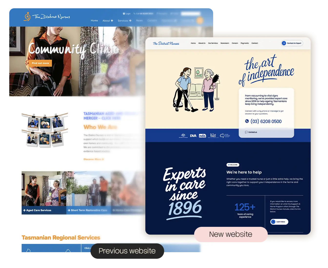
The old website already had warmth. It used real care photography, a familiar blue-and-orange healthcare palette and a fairly traditional nonprofit service layout. There was nothing wrong with it in a simple visual sense.
But it carried a lot.
There were many links, many pathways, many service names and a homepage that had to explain who The District Nurses were while also pushing people toward aged care, home care packages, private services, restorative care, regional information, contact details and more.
That is common in care organisations. The work is complex because people’s lives are complex. Funding models change. Service categories overlap. Families arrive at the site at different levels of stress, confidence and understanding.
The brand has to do more than look trustworthy. It has to reduce the effort required to get help.
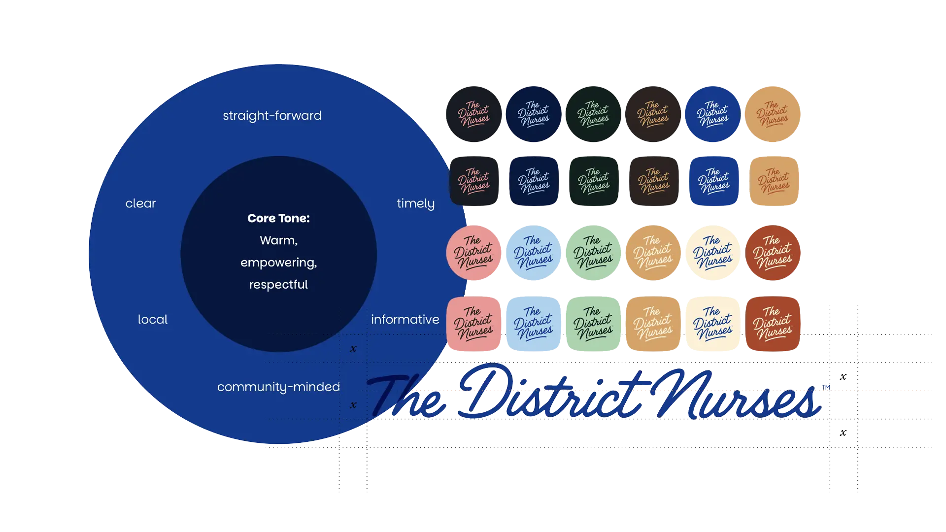
The logo did not need to become something else
We modified the logo rather than replacing it outright.
That mattered.
For a long-running care organisation, a logo is not just a mark. It is a memory cue. People may have seen it on a brochure, a fridge magnet, a nurse’s uniform, a vehicle, a referral form or a letter sent to a family member. If you remove too much, you risk removing recognition.
So the work was careful. Keep the handwritten, human quality. Make it more usable. Give it enough confidence to work on a modern website, in campaign material, in documents, on social posts and inside a formal brand system.
The revised mark feels personal without feeling fragile. It still has a community-care quality, but now it can sit inside a cleaner and more consistent system.
That is usually the sweet spot with heritage brands.
You do not preserve everything. You preserve the equity.
Turning independence into a creative platform
The campaign line, “the art of independence”, became a useful anchor because it moved the conversation away from care as a list of tasks.
The District Nurses help with practical things: vacuuming, medication, wound care, meal preparation, social support, gardening, restorative care, vital signs monitoring and more.
But the point of those services is bigger than the task itself.
The point is independence.
That gave the brand a warmer and more flexible centre of gravity. It let the website speak to families and clients in plain language while still respecting the clinical and operational seriousness of the organisation.
“From vacuuming to vital signs monitoring” is a good example of the tone. It is specific. It is not trying to sound grand. It shows the range of care in one sentence, from everyday domestic support to clinical expertise.
That kind of line does more work than a generic promise about compassion or quality.
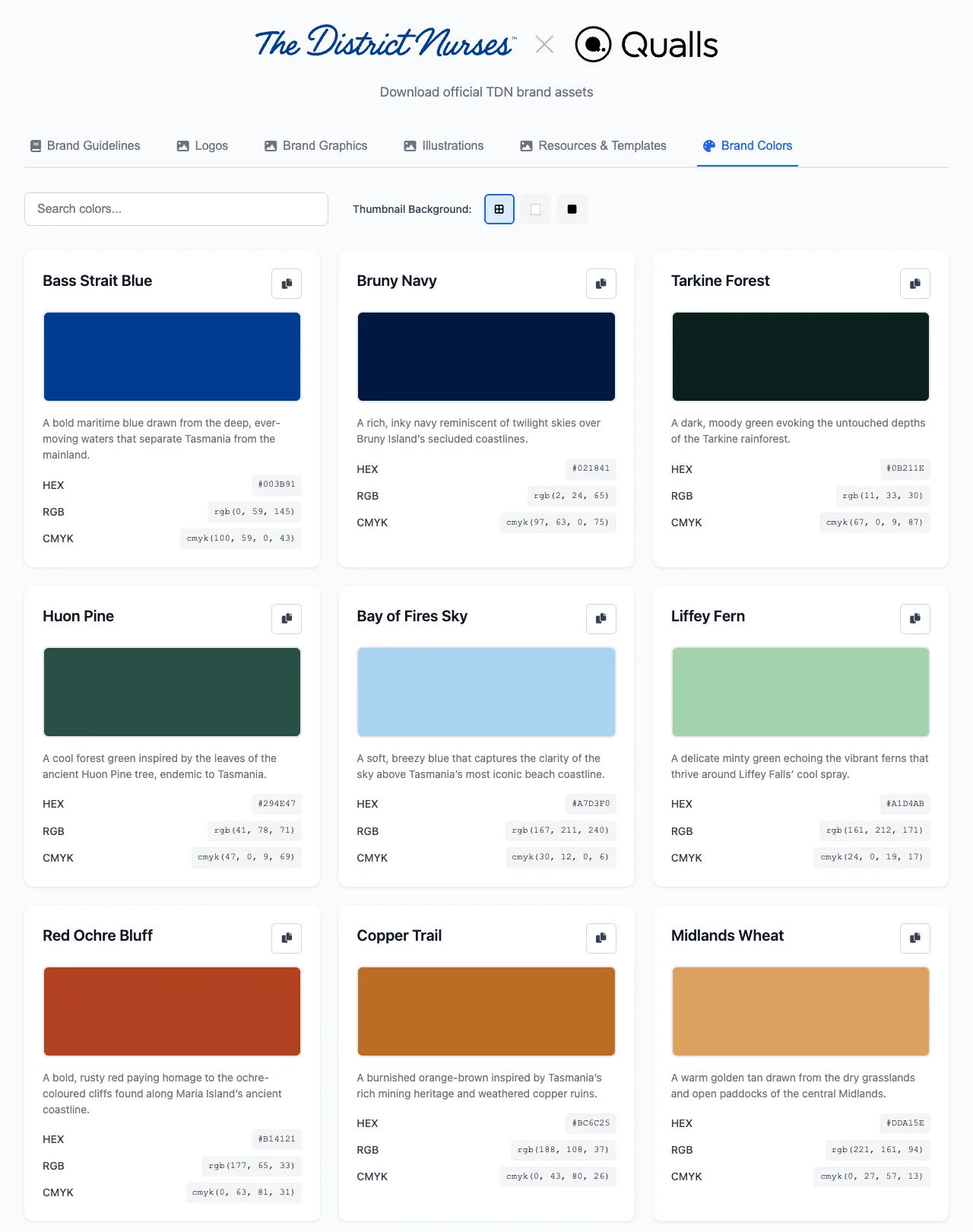
A colour system with a place in it
The colour palette needed to do more than say “healthcare”.
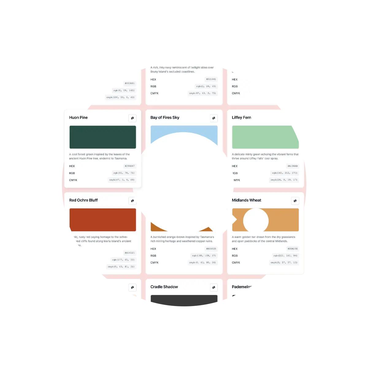
So instead of building a palette around abstract names, the colours were tied back to Tasmania:
Bass Strait Blue. Bruny Navy. Tarkine Forest.
Huon Pine. Bay of Fires Sky. Liffey Fern.
Red Ochre Bluff. Copper Trail. Midlands Wheat.
Freycinet Sand. Dove Lake Fog. Night on Kunanyi.
That naming is not cosmetic. It gives the brand a sense of place.
The District Nurses are not a generic care provider that could be picked up and dropped anywhere. Their story belongs to Tasmania. The palette needed to carry that quietly, without turning every page into a tourism campaign.
The blues and navies give the system trust and structure. The greens and earth tones make it feel grounded. The softer pinks, sands and sky colours stop it becoming too institutional.
Together, they give the brand a much wider emotional range than the old blue-and-orange system.
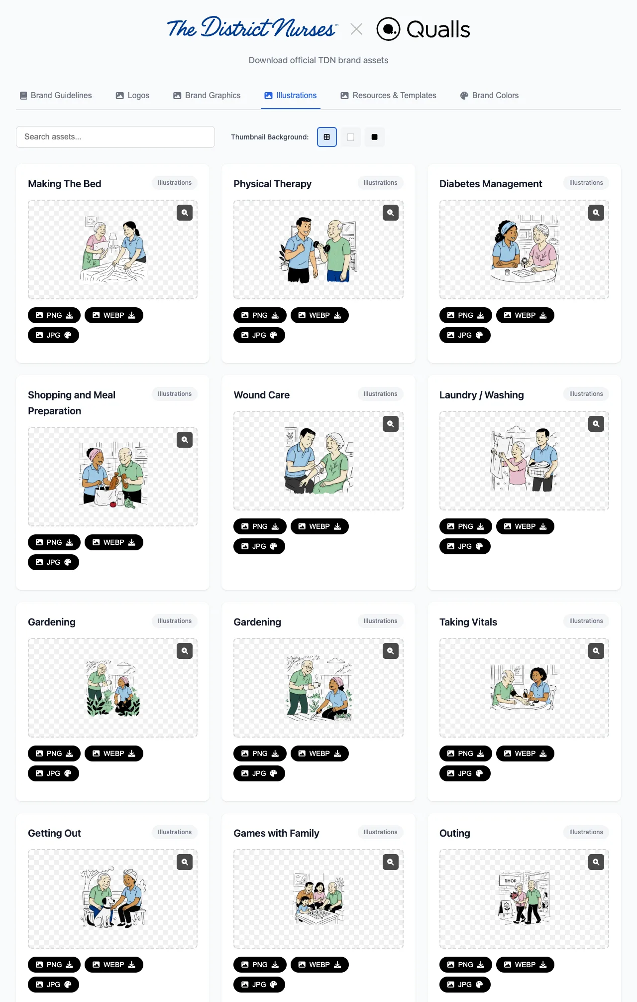
Illustrations made the care feel everyday
Healthcare brands often default to stock photography. Sometimes it works. Often it does not.
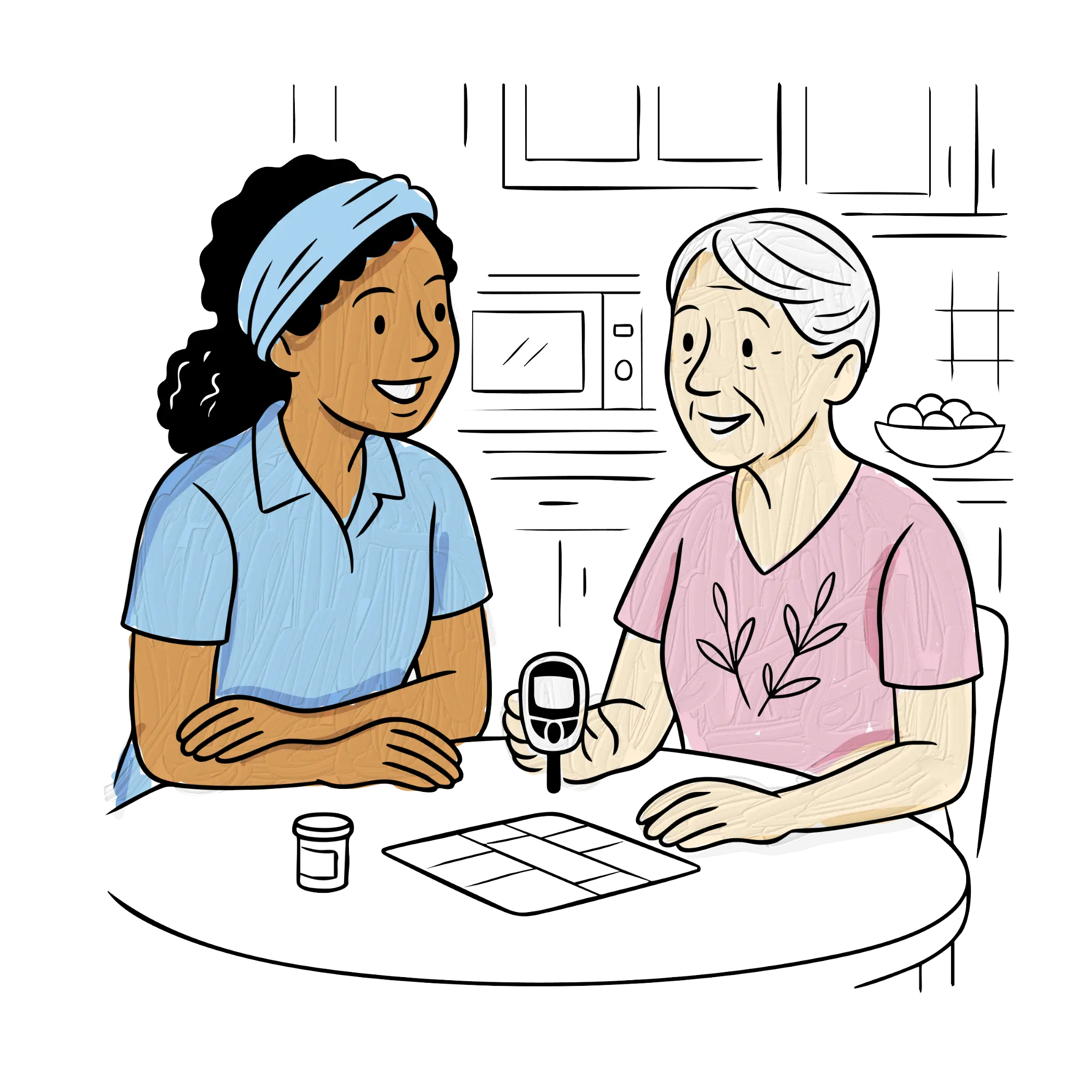
The problem is not photography itself. The problem is sameness. A smiling nurse. A hand on a shoulder. A staged living room. A carefully lit moment that feels like it came from the same image library as every other care provider.
For The District Nurses, custom illustration gave us another tool.
The illustration system could show practical, ordinary, human moments: making the bed, gardening, wound care, taking vitals, shopping and meal preparation, physical therapy, laundry, medication, playing cards, getting out, cooking, cleaning, a nurse arriving at the door.
Those scenes matter because they reflect how care is actually experienced. Not as one big emotional brand moment, but as a hundred small supports that help someone keep living at home.
The hand-drawn style also helped soften the service experience. It made the brand warmer, more ownable and less dependent on perfect photography for every communication.
The website had to clarify pathways
The new website needed to make the service offer easier to navigate.
That is harder than it sounds.
A care website has several audiences at once: older Tasmanians, adult children, carers, referrers, staff, job seekers, funders and partners. Some people know exactly what they are looking for. Others arrive because something has changed at home and they need to understand what support is possible.
The new homepage puts a clearer public story up front:
From vacuuming to vital signs monitoring, we’ve provided expert care since 1896 to help ageing Tasmanians keep living independently.
That sentence does a lot. It explains the service range, establishes history and lands the independence idea without forcing the user through internal terminology first.
The site then gives the service categories more breathing room. Commonwealth Home Support Program. Support At Home Program. Restorative Care Pathway. Private and Brokered Services. Under 65 and Disability Care. Veterans’ Services. End of Life Care.
The structure still respects the operational reality, but the experience is calmer.
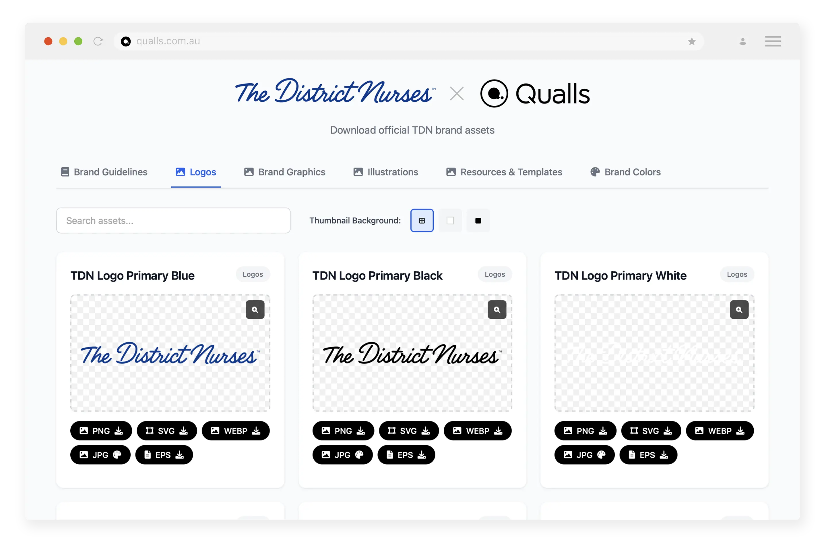
The brand hub was part of the work, not an afterthought
A brand system only matters if people can use it.
That is why the brand hub was important. The District Nurses needed more than a PDF sitting in someone’s downloads folder. They needed a practical place where the team and partners could find the right logos, colours, graphics, illustrations, templates and rules.
The hub gives the brand a source of truth.
It also protects the work after launch. That is the part people often underestimate. A rebrand can look good on day one and slowly fall apart over the next year as files get copied, colours get guessed, logos get stretched and one-off documents start drifting away from the system.
The brand hub reduces that risk. It makes correct usage easier than incorrect usage.
That is not glamorous brand work, but it is the part that keeps the brand alive in the real world.
The result
The refreshed brand is not louder. It is clearer.
It keeps the human qualities that made The District Nurses recognisable, then gives those qualities a stronger system: a modified logo, a place-based colour palette, custom illustrations, a clearer website, a campaign idea and a brand hub that helps the organisation keep using the system properly.
That is the kind of branding process we like.
Not a cosmetic reset. Not a moodboard with a logo attached. A practical system built around the organisation’s actual work.
For The District Nurses, that work is deeply human: helping ageing Tasmanians keep living independently in the homes and communities they love.
The brand needed to feel like that.
And just as importantly, it needed to work like that.