


Q+A · No. 02 · Files
What is the difference between raster and vector?
Raster images are built from pixels. Vector artwork is built from instructions. That one difference explains most fuzzy-logo problems.
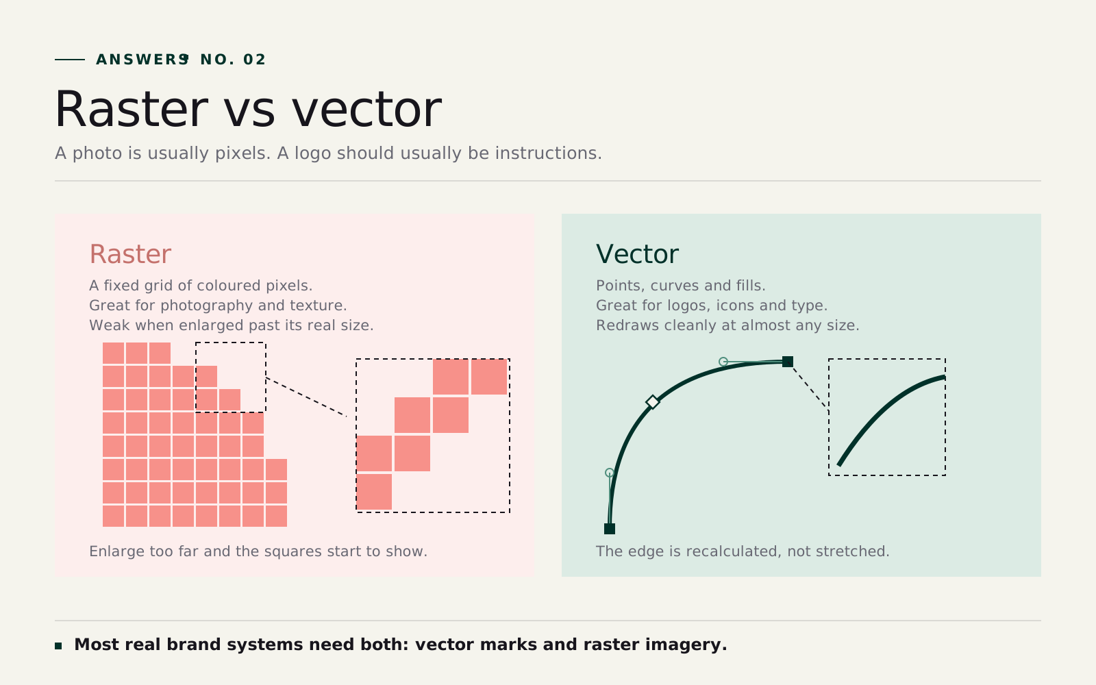
A raster image is a fixed grid of pixels, which makes it perfect for photographs and terrible at being enlarged. A vector file is a set of drawing instructions, so it redraws cleanly at any size, which is exactly what a logo has to do.
Photos should usually be raster. Logos, icons and marks should usually be vector. Most finished work uses both.
The longer answer
Raster is a grid
A raster file is made of tiny coloured squares. Put enough together and you get a photograph, a texture or a social post. The grid is why raster images are good at detail. Skin, shadow, fabric and subtle gradients all live comfortably in pixels.
The catch is size. If a raster image has enough pixels for the job it can look beautiful. If it doesn't, enlarging it won't create new detail. It only stretches what's already there. That's where blur and pixelation come from.
Vector is a set of instructions
A vector logo is stored as points, curves, shapes and fills, and the maths redraws the edge at whatever size you need. That's why the same file can move from a favicon to a shopfront sign without going soft.
This is why designers ask for vector logos. The mark has to hold up in everyday use: website, embroidered uniform, pull-up banner, vehicle wrap, sponsorship lockup, presentation cover.
A logo should usually be vector
If you're sending a logo to a designer, printer, signage supplier or apparel company, start with vector: .ai, .eps, .svg or a properly exported vector .pdf. A transparent PNG is still useful for presentations and email signatures, but the vector is the master and the source of truth.
A photo should usually be raster
Photography needs pixel-level detail, so it stays raster. What matters is having enough image for the intended output. A photo that looks fine on a phone may not hold up on an A1 poster, and a cropped social image may not leave enough room for a billboard layout. Resolution is simply the relationship between the file and the final size.
Most finished work uses both
A brochure may combine a vector logo, vector icons, live type and raster photography. A website may use SVG icons with WebP imagery. The mistake is treating one format as universally better. Vector wins when the artwork needs clean edges and flexible scale; raster wins when it needs photographic detail.
The zoom test
Not sure what you have? Zoom in. If the edge breaks into little squares, it's raster. If it stays crisp, it's vector. That test explains why a designer might reject a file that looks fine at thumbnail size: the file is being judged by what it has to do next.