


The work behind work that just works
Figma feels simple because someone made the hard calls underneath. What the team’s behind-the-scenes video teaches brand, product and content teams about hiding complexity.
 Words:
 There is a line in Enrico Tartarotti’s behind-the-scenes video with the Figma team that should probably be printed out and taped to the wall of every studio, product room and marketing department:
Users don’t care about your rules. They care that it works how they expect. And they’re not the same thing.
That is the whole game, really.
A lot of organisations think good design is what happens when a system is clean, logical and well documented. That helps. But people do not experience your internal logic. They experience the thing in front of them, usually while trying to get something done.
If the system is technically correct but behaves in a way that feels wrong, it is wrong.
The video is fascinating because it does not treat Figma’s simplicity as magic. It shows the opposite. Figma feels simple because a huge amount of design, engineering and product judgement has been pushed behind the surface.
Early in the video, Enrico says:
The products that seem so simple and magical, the ones that just work, are actually the ones that hide the most complexity. You just never get to see it.
That is a useful way to think about almost any brand or digital project.
The clean surface is rarely the hard part. The hard part is deciding what the surface should not have to explain.
Simple is not the same as basic
Figma is a powerful tool. It handles design files, multiplayer collaboration, comments, components, design systems, developer handoff, plugins, prototypes and now AI-assisted work on the canvas.
But the interface does not open by shouting all of that at you.
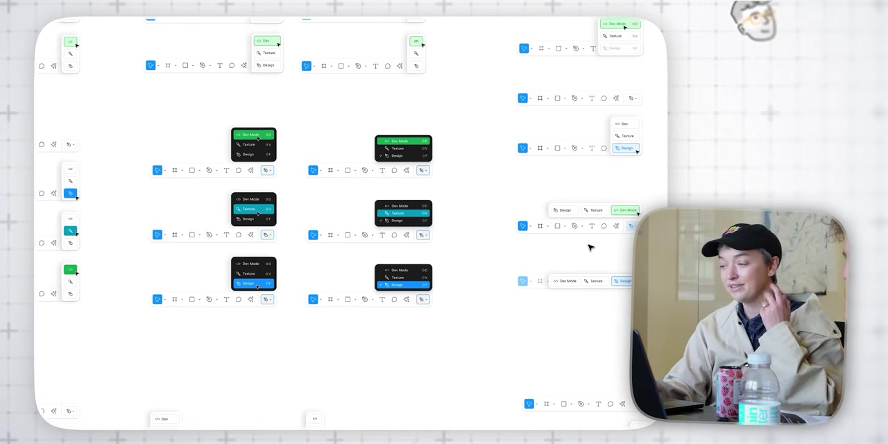
That restraint is not accidental. In the video, the team talks through tiny behaviours that most users would never consciously notice: what happens when you paste an object into a frame, which layer moves when one object sits visually above another, how alignment behaves when several selected items belong to different groups, and why undo should sometimes undo a selection mistake even though the file itself did not change.
One of the Figma team members says:
Copy and paste is a whole other mess in terms of rules, but because we spent so much time deciding what the rules are… it now mostly does the right thing.
That phrase, “mostly does the right thing,” is doing a lot of work.
It is not the same as “follows the rule.” In fact, the video shows cases where following the pure rule would create a worse experience. If an object is pasted according to exact coordinates but lands out of view, the system may be accurate, but the user is lost.
So Figma bends the rule to protect the experience.
That is design maturity.
Not decoration. Not taste. Judgement.
The best work hides the argument
Good creative work often feels obvious after it exists.
The line feels obvious. The homepage structure feels obvious. The campaign hierarchy feels obvious. The CMS feels obvious. The sales deck feels obvious.
But obvious is usually the result of decisions that were not obvious at all.
The Figma team says it plainly:
The best products and the best product decisions are ones that lead to simplicity. Getting to the simplicity is the hardest part.
That applies well beyond software.
A brand system should hide the argument that produced it. A website should not expose every internal priority equally. A campaign should not make the audience sort through the meeting notes. A service page should not carry the whole org chart. A pitch deck should not prove how hard the team worked by showing every possible detail.
The work should arrive with the right amount of confidence.
That does not mean stripping everything back until it is plain. Plain can be lazy. It means doing enough thinking behind the scenes that the person using the thing gets a cleaner path.
At Qualls, this is where our “useful by design” bias comes from. The work should be noticed, yes. But it should also reduce friction. It should help someone understand faster, decide with more confidence, or take the next step without needing a guided tour.
The undo button is a brand lesson
One of the smallest examples in the video is also one of the best.
In most tools, undo reverses a change to the file. But in a design tool, a misclick can be expensive even if it does not technically alter the file. You lose a careful selection. You interrupt your flow. You have to rebuild the state you were in before the mistake.
A Figma team member describes the feeling:
Most tools don’t allow you to undo a selection. Like, that wasn’t worth undoing. And I’m like, ‘No, that was worth undoing. Please just undo this for me.’
That is such a small thing. It is also exactly the kind of small thing that makes people trust a product.
The system understands the human cost of the mistake, not just the technical definition of one.
Brands have their own version of this.
A customer should not have to re-explain context every time they move from sales to service. A donor should not have to decode internal program names to understand where their money goes. A client should not have to read five pages before finding the next action. A marketer should not have to rebuild a layout from scratch because the brand system only works in the original presentation.
The technical rule might be defensible. The experience may still be wrong.
Progressive complexity beats forced complexity
The video also gets into one of the hardest product design problems: how to make something powerful without making it scary.
Figma has serious depth. Components, libraries, variables, developer workflows and design systems can become sophisticated quickly. But the product still lets someone start by drawing, duplicating, moving and editing simple objects.
One quote captures the attitude nicely:
Do you want to use a design system? Cool, use a design system. Do you just want to duplicate your frame 10,000 times and edit every border by yourself? That is okay, too.
That is progressive complexity. Let people enter at the level they are ready for. Let the system reveal more power as the user’s need becomes more specific.
This matters for websites and content systems too.
A good CMS should not punish a marketing team for wanting control. A good page builder should not require a developer for every content change. A good brand system should not force every user to understand the entire architecture before they can make one decent asset.
Power should be available. It does not need to be dumped on the table all at once.
AI makes the old design problems new again
The last section of the video looks at Figma’s AI work. This is where the piece becomes less about Figma as a tool and more about the next wave of interface design.
AI introduces a strange challenge: the user can ask for almost anything, but the system still has to decide what the request means inside a specific working environment.
A Figma team member gives a simple example:
If I say make this centered, does that have a right answer? Yes. But something like make this title pink, does that have a right answer? That depends.
That is the new design problem in a sentence.
AI does not remove the need for product judgement. It increases it. The system has to understand intent, context, available objects, layout rules, design constraints and what the user probably meant but did not spell out.
This is why the easy AI story, “just prompt it and it works,” is too thin.
The useful AI products will not be the ones that throw a chatbot onto the side of an existing workflow and call it innovation. They will be the ones that understand where the user is, what they are touching, what they are likely trying to do, and how much control they need before the system becomes annoying.
In the video, Figma experiments with where the assistant should live on the canvas, how visible it should be, when it should disappear, how it should stay out of the way, and how it should borrow interaction patterns people already understand from comments.
That is the detail that matters. Not “we added AI.”
Where does it live?
When does it appear?
What does it know?
How does it recover when it gets the wrong idea?
Can the user fix the output quickly?
Does it preserve flow, or does it become another panel to manage?
Those are design questions before they are technology questions.
What we take from it
The reason this video feels relevant to our work is not because every client needs a product interface as deep as Figma.
Most do not.
But every organisation has some version of the same problem. There is complexity behind the offer. Complexity behind the service. Complexity behind the internal process. Complexity behind the buyer journey. Complexity behind the content model, the approvals, the campaign, the sales conversation and the handoff.
The question is where that complexity should go.
Bad work hands it to the audience. Good work absorbs it.
That is the lesson from Figma. The surface can feel simple because somebody cared enough to make the hard decisions underneath it.
That is also a useful standard for brand, campaign, digital and content work.
Make the important thing easier to see. Make the next step easier to take. Make the system easier to use. Hide the complexity where it belongs.
Not because the work is simple.
Because the experience should be.